

Apple unveiled the logos for Apple Intelligence and the AI-powered Siri during its WWDC presentation. The design goals for these logos aim to create a friendly, non-threatening, and non-human-like image, a trend observed across many tech companies venturing into AI branding.
Design Goals and Aesthetic Choices
- Friendly and Non-Threatening: Apple aimed for the Apple Intelligence logo to evoke a sense of friendliness and approachability. This approach helps users perceive the technology as non-threatening and easy to interact with.
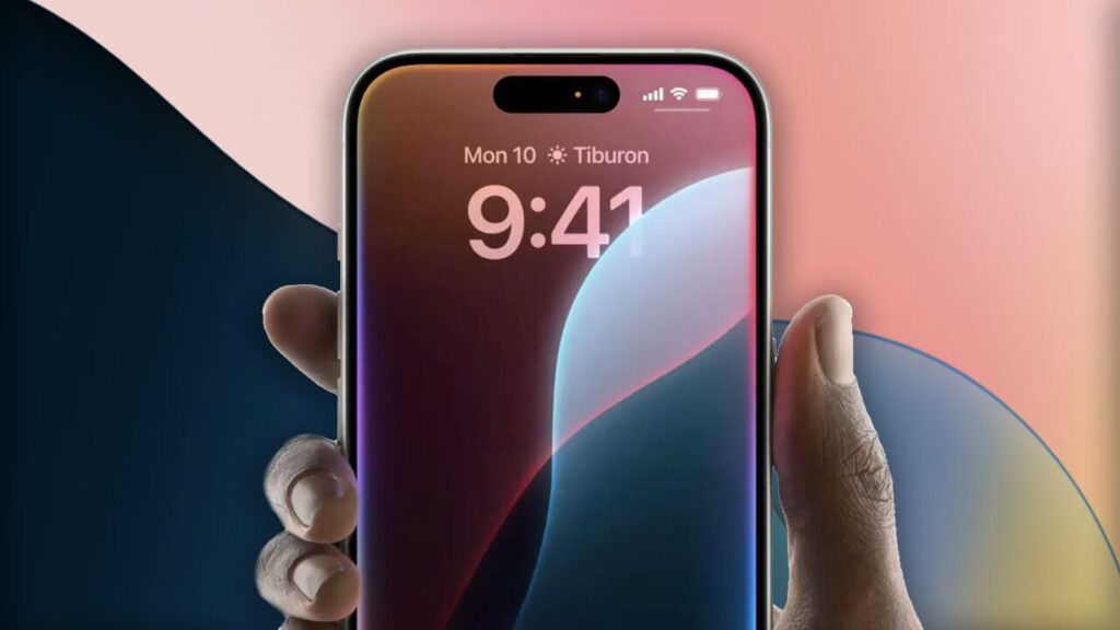
- Color Scheme: The logo uses bright, cheerful colors and pastel tones. This choice is intended to evoke positive emotions and make the technology appear welcoming.
- Simple and Soft Shapes: The design incorporates smooth and continuous shapes, avoiding sharp edges or complex patterns. This simplicity and fluidity add to the non-threatening perception.
- Avoidance of Human-like Representation: Apple consciously avoided making the logo look human-like or robotic. This decision ensures that users do not feel intimidated by the AI, reinforcing the idea of the technology being a helpful tool rather than a replacement for human interaction.
Industry Trends
Many companies in the AI sector are adopting similar design philosophies. Logos for AI technologies often feature friendly, non-threatening designs with bright colors and simple shapes. This trend aims to make AI more accessible and less intimidating to the general public.
Design Details
- Pastel Tones: Used to evoke calmness and approachability.
- Continuous Shapes: To symbolize fluidity and ease of interaction.
- Cheerful Colors: To create a positive and friendly image.
Conclusion
Apple’s approach to designing the Apple Intelligence logo reflects a broader industry trend towards making AI appear friendly and non-threatening. This strategy not only aims to ease user adoption but also to position AI as a supportive tool in daily life. The thoughtful use of colors, shapes, and overall design principles highlights the importance of visual elements in shaping user perceptions of emerging technologies.
What do you think about Apple’s approach to its Apple Intelligence logo? Share your thoughts in the comments below!